How to Create a Gallery Wall: Layout Ideas and Tips
The Wall That Tells Your Story
A gallery wall is more than a design choice — it's autobiography. It's the place where your taste, your memories, and your eye for beauty come together on a single surface. Done well, it becomes the most magnetic feature in any room. Done carelessly, it becomes clutter.
The difference between the two is intention. And intention, fortunately, is something you can learn.
Whether you're working with two pieces or twelve, this guide will help you create a gallery wall that feels curated rather than chaotic — one that looks like it evolved naturally over years of collecting, even if you hung it all on a Saturday afternoon.
Four Layout Patterns That Work
Every great gallery wall follows an underlying structure, even when it appears effortless. Here are four proven patterns to choose from:
1. The Grid
Clean, modern, and deeply satisfying. A grid arrangement places pieces in precise rows and columns with uniform spacing. This works best when your pieces share a consistent size or frame style.
Best for: Modern interiors, hallways, stairwells, or anywhere you want order with impact.
Pro tip: A grid of three or four identically framed pieces from the same collection creates a sense of cohesion that single pieces can't achieve. Think of it as visual rhythm — each piece a beat in the same measure.
2. Salon Style
Named after the densely hung walls of 18th-century Parisian salons, this layout is eclectic, organic, and full of personality. Pieces of different sizes and orientations are arranged in an asymmetrical cluster, usually anchored around a central piece.
Best for: Living rooms, creative spaces, and collectors who want to display works of varying sizes together.
Pro tip: Start with your largest piece slightly off-center, then build outward. Maintain roughly consistent spacing (5–8 cm between frames) even as the arrangement becomes more organic. The eye needs just enough order to find its way through the beautiful chaos.
3. The Column
A vertical stack of two or three pieces, aligned along a center axis. This is the most underestimated layout — elegant, space-efficient, and perfect for narrow walls that can't accommodate a horizontal spread.
Best for: Entryways, between windows, narrow hallways, or beside doorways.
Pro tip: Vary the sizes within the column. A larger piece on top with a smaller piece below (or vice versa) creates visual movement. Equal sizes work too, but unequal sizes feel more dynamic.
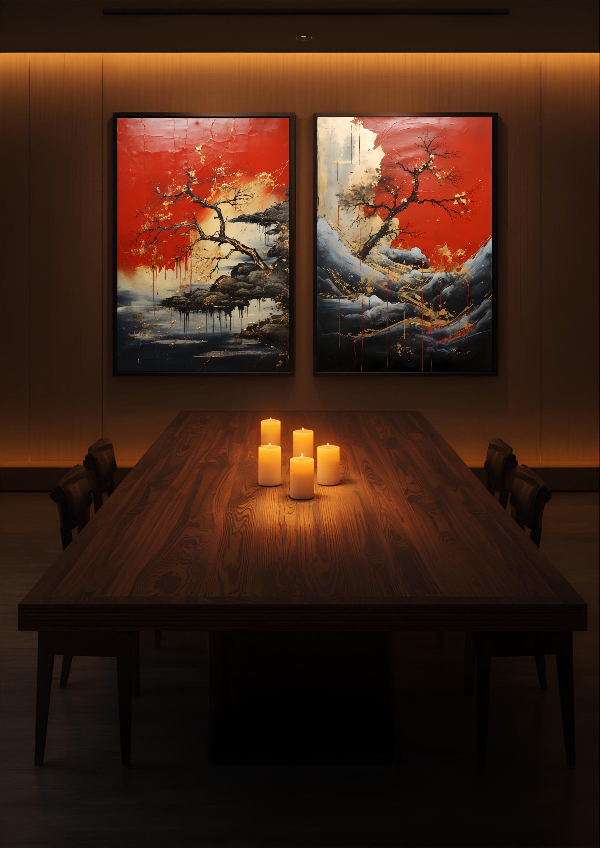
4. The Triptych
Three pieces hung side by side, telling a single visual story across multiple frames. This is perhaps the most dramatic option — a triptych creates cinematic presence on any wall.
Best for: Above sofas, beds, dining tables, or any wide wall that needs a focal point.
Pro tip: The three pieces don't need to be from a single artwork. They can be three separate pieces that share a color palette, mood, or theme. Gilded Fractures, Golden Scars, and Ripped Apart form a stunning gold-themed triptych — three expressions of the same philosophy, each distinct but unmistakably connected.
Spacing and Placement
The technical details matter more than you might think. Small adjustments in spacing and height can transform a gallery wall from "almost right" to "absolutely perfect."
Between frames: Keep spacing consistent at 5–8 cm. Closer spacing (5 cm) creates a tighter, more unified composition. Wider spacing (8 cm) gives each piece more room to breathe. Choose one distance and stick with it throughout.
Height: The center point of your arrangement should sit at eye level — approximately 145–150 cm from the floor. In dining rooms or bedrooms, drop this by 10–15 cm since you'll be viewing the art while seated.
The paper template trick: Before you pick up a hammer, cut pieces of craft paper to the exact dimensions of each frame. Tape them to the wall with painter's tape and live with the arrangement for a day or two. Rearrange until it feels right. Then hang the real pieces using the paper as your guide. This single step prevents more regret than any other.
Start with the anchor: Always hang your largest or most important piece first. Everything else orbits around it.
Pairings That Work
The art you choose matters as much as how you arrange it. Here are combinations we love:
A red-toned gallery wall: Blood Petals paired with Crimson Tide creates a rich, warm palette of deep reds and dramatic contrasts. Add these to a dining room wall and the space transforms into something intimate and alive.
A gold-themed triptych: Gilded Fractures, Golden Scars, and Ripped Apart — three pieces united by luminous gold running through darkness. Hung side by side, they create the visual equivalent of a chord in music. Each piece is complete on its own, but together they become something larger.
Mixing sizes: One of the most effective gallery wall techniques is combining different print sizes. A 70x100 cm piece anchored by two 40x50 cm pieces creates natural hierarchy — your eye goes to the large piece first, then explores the smaller ones. It's how galleries have been hanging shows for centuries.
Common Mistakes to Avoid
Hanging too high. This is the single most common error. Art should be at eye level, not ceiling level. If you have to tilt your head up to see it, it's too high.
Going too small. A gallery wall needs presence. If the total arrangement doesn't occupy at least 60–75% of the available wall space above your furniture, it will look like an afterthought rather than a statement.
Mixing too many frame styles. Variety is good. Chaos is not. Limit yourself to two or three frame types maximum. If your pieces share a consistent palette (as KintsugiBo pieces do — golds, blacks, deep reds), the artwork itself provides enough variety without the frames competing for attention.
Overthinking it. At some point, you have to trust your eye. If it looks right, it is right. The paper template method gives you a safety net, but your instinct is the final judge.
Start Building
The most beautiful gallery walls we've seen from our collectors didn't happen all at once. They started with one piece that stopped them in their tracks, then grew over time as new works found their way home. Each addition changed the conversation on the wall — a new voice joining the chorus.
Start with a piece that moves you. Find its place on the wall. Then let the story build from there.
Looking for your anchor piece? Browse the full collection and find the one that starts your gallery wall.
Geschrieben von
KintsugiBo
Wir feiern die Unvollkommenheit durch Kintsugi-inspirierte Kunst.