How to Frame Art Like a Gallery: A Complete Guide
The Invisible Craft
Walk into any gallery or museum and the art on the walls seems effortless — perfectly presented, naturally commanding attention. What you don't notice is the framing. And that's exactly the point.
Great framing is invisible. It doesn't compete with the artwork or shout about itself. It simply creates the conditions for the art to be seen at its best — protected, elevated, and integrated into the space around it.
Framing is one of the most overlooked aspects of living with art. A beautiful print in a poor frame is like a great meal on a paper plate. The content is still good, but the experience is diminished. Conversely, thoughtful framing can elevate even a modest print into something that feels museum-worthy.
Here is everything you need to know.
Why Framing Matters
Framing serves three purposes, and all three matter:
Protection. A proper frame shields your artwork from dust, moisture, UV light, and physical damage. Fine art prints — especially those on cotton rag paper — are sensitive to environmental conditions. Good framing preserves them for decades.
Presentation. The frame is the transition between the artwork and the wall. It creates a visual boundary that tells the eye: this is where the art begins. Without that boundary, artwork can feel unfinished or lost against the wall.
Integration. The right frame connects the artwork to its surroundings — bridging the gap between the art's world and the room's world. A piece that clashes with its environment will never feel at home, no matter how beautiful it is.
Choosing Your Frame
There is no universal "best" frame. The right choice depends on the artwork, the room, and the atmosphere you want to create. Here are the options we recommend, and when each one works best:
Unframed (Canvas or Print Only)
Sometimes the most powerful choice is no frame at all. An unframed canvas or a print mounted directly to a panel creates a contemporary, minimal look that puts the focus entirely on the artwork itself.
Best for: Modern interiors, gallery walls where the art should feel immediate and unmediated, or textured pieces where the surface quality is part of the experience.
Consider this when: Your space is already clean-lined and contemporary. The absence of a frame becomes a design choice in itself — confident and understated.
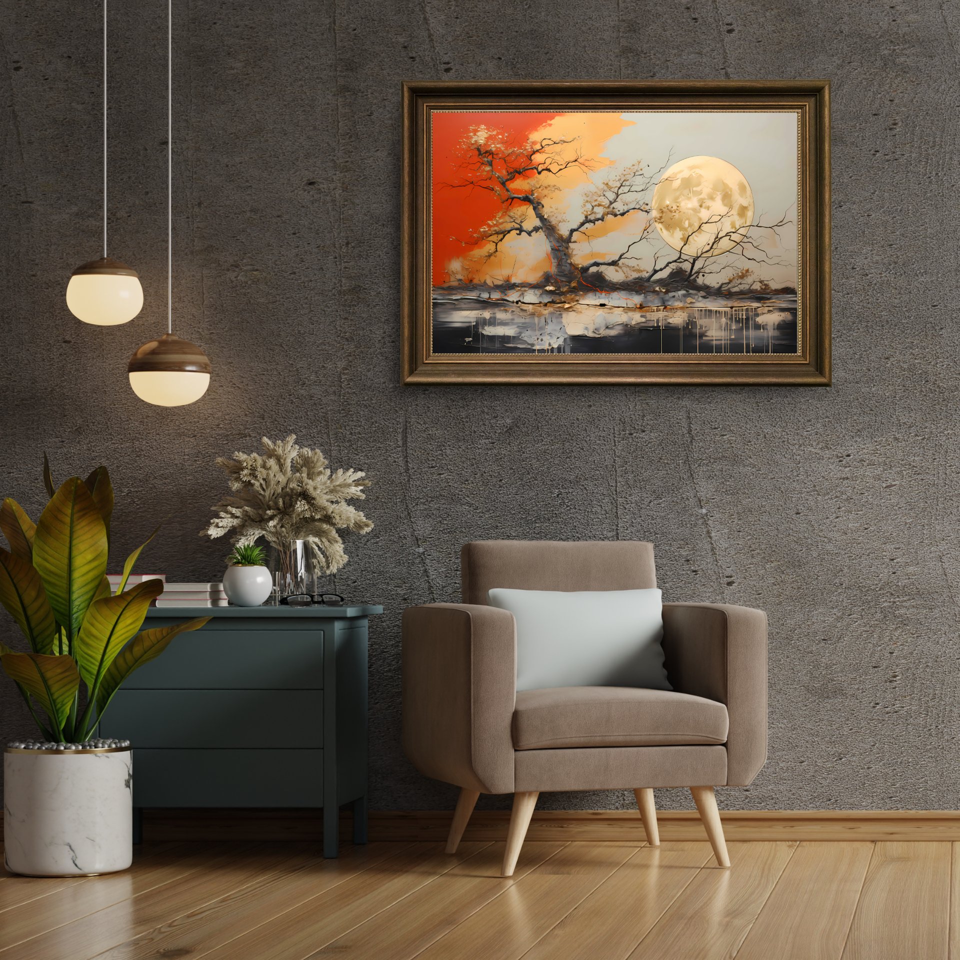
Black Frame
The workhorse of contemporary art presentation. A black frame creates a clean, precise border that works in virtually any setting. It recedes visually, letting the artwork take center stage while providing structure.
Best for: Modern spaces, dark-toned interiors, and artwork with high contrast or strong compositions. Black frames pair particularly well with our pieces — the deep blacks in the artwork extend naturally into the frame, creating a seamless visual experience.
At KintsugiBo, our black frame option (+€49) uses a slim profile that adds presence without bulk.
Dark Wood Frame
Warm, classic, and quietly sophisticated. A dark wood frame adds richness and depth that black alone cannot achieve. The natural grain of the wood introduces organic texture — a subtle reminder that even the frame is a natural material with its own story.
Best for: Traditional interiors, warm-toned rooms, libraries, and dining spaces. Dark wood softens the formality of framed art and makes it feel more approachable, more lived-with.
Our dark wood option (+€45) uses a walnut-toned hardwood that complements the warm golds and terracottas in our palette.
Natural Wood Frame
Light, fresh, and unmistakably Scandinavian in feel. A natural wood frame brightens the presentation and creates beautiful contrast with darker artwork. It's the most versatile option for lighter interiors.
Best for: Bright rooms, Scandinavian or minimalist design, bedrooms, and spaces where you want the art to feel approachable and warm. Natural wood makes dark, dramatic artwork feel accessible rather than imposing.
Our natural wood option (+€39) uses a light ash that catches and reflects ambient light.
The Role of Matting
A mat (or mount) is the border of card or paper between the artwork and the frame. Matting is optional, but when used well, it transforms the presentation:
When to use a mat:
- When you want to create breathing room around the artwork
- When the frame is close in value (light or dark) to the artwork — the mat provides separation
- When you want a more traditional, gallery-quality presentation
Choosing mat color: White or off-white is almost always the safest choice. For darker artwork, a warm off-white (sometimes called "antique white" or "cream") prevents the harsh contrast that pure white can create. For a more dramatic presentation, a black mat with a black frame creates a deep, window-like effect.
Proportions: A general rule is that the mat should be approximately 5–8 cm wide on all sides. Some framers prefer a slightly wider bottom margin (by 1–2 cm) to counteract the optical illusion that makes centered mats look bottom-heavy. Trust your eye on this — the difference is subtle but real.
Glass Options
The glass you choose has more impact than you might expect:
Standard glass provides basic protection and is the most affordable option. The downside is glare — in bright rooms or when hung opposite a window, reflections can obscure the artwork.
Anti-glare glass (also called non-reflective glass) has an etched surface that diffuses reflections. It works well in bright spaces but can slightly soften the appearance of the artwork. For detailed, high-contrast pieces, this trade-off is worth considering.
UV-protective glass blocks ultraviolet light that causes fading over time. If your artwork receives any direct or indirect sunlight, UV glass is a worthwhile investment. Most conservation-grade glass blocks 97–99% of UV radiation.
Museum glass combines anti-glare properties with UV protection and exceptional optical clarity. It is the gold standard — virtually invisible, fully protective, and remarkably clear. It is also the most expensive option. For pieces you plan to live with for years, museum glass is the choice you won't regret.
Hanging: The Final Step
You've chosen your frame, your mat, and your glass. Now it comes down to the wall.
Eye level, always. The center of your artwork should sit at approximately 145 cm (57 inches) from the floor. This is the standard gallery hanging height and it works because most people's natural eye level falls in this range. In dining rooms, drop it by 10–15 cm to account for seated viewing.
Use the right hardware. For pieces under 5 kg, picture hooks are sufficient. For anything heavier, use wall anchors rated for the weight. When in doubt, use two hooks spaced apart rather than one — the weight distributes more evenly and the piece hangs more securely.
Measure twice. Mark your hook placement with painter's tape before drilling. Measure the distance from the top of the frame to the hanging wire or bracket when the wire is taut — that measurement tells you exactly how far below your desired center point to place the hook.
Level matters. Use a spirit level, not your eye. Even a one-degree tilt is visible and will bother you every time you walk past.
The Gallery Feeling
The difference between art hung in a home and art hung in a gallery is rarely about the art itself. It is about framing, placement, and care. When you take the time to frame a piece properly, hang it at the right height, and light it well, something shifts. The wall becomes a destination. The room gains a focal point. The art feels like it belongs.
That is the gallery feeling — and it's available to everyone, in every room, with every piece.
All KintsugiBo prints are available with our curated framing options. Explore the collection and choose the frame that brings your piece to life.
Geschrieben von
KintsugiBo
Wir feiern die Unvollkommenheit durch Kintsugi-inspirierte Kunst.